

.svg%201.webp)
AU Quartier des Suisses
Restaurant
Au Quartier des Suisses" is a restaurant inspired by the rich culinary heritage of Switzerland. It offers guests an authentic dining experience where traditional Swiss recipes meet refined French presentation.
Blendselegance and warmth, creating an ambiance where every detail—from the interior design to the table setting—emphasizes the high level of gastronomic artistry. The menu features classic Swiss dishes such asfondue, raclette, rösti, and Swiss desserts, alongside signature interpretations by the head chef.

To design aunique and premiumlogo that reflects therestaurant’s concept, ambiance, and gastronomic uniqueness.
- The logo should be minimalist, elegant, and modern
- The design should be based on the initials of the restaurant’s name (AQDS – "Au Quartier des Suisses")
- A unique, serif typography should be used to create a premium and recognizable identity
- Color palette: deep warm tones, reminiscent of Swiss chocolate and coffee
A logo that conveyspremium quality, culinary artistry, and the unique ambiance of "Au Quartier des Suisses", helping the restaurant stand out among competitors and establish itself as a recognizable brand inone of France’s most historically significant towns.
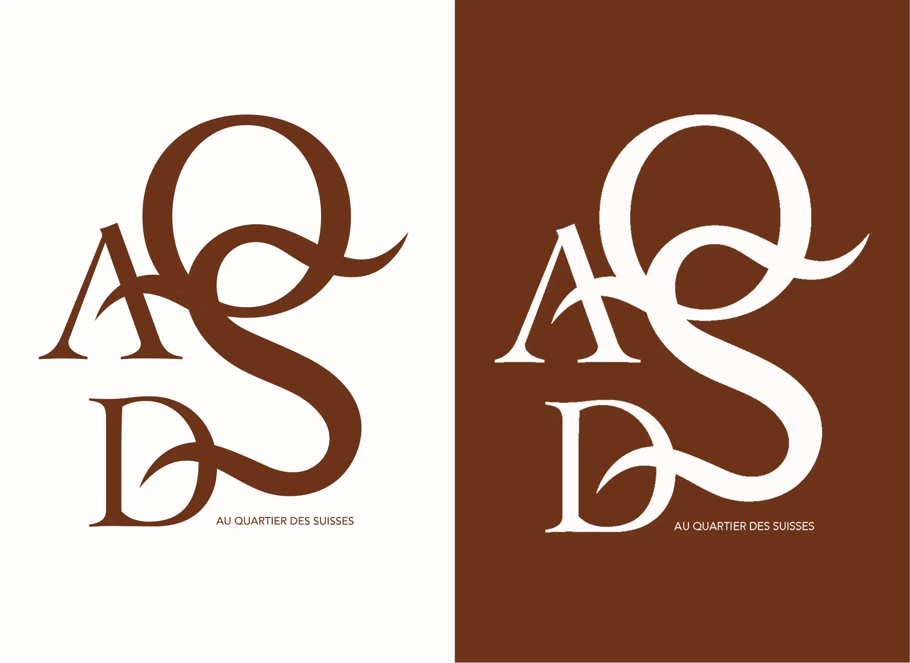
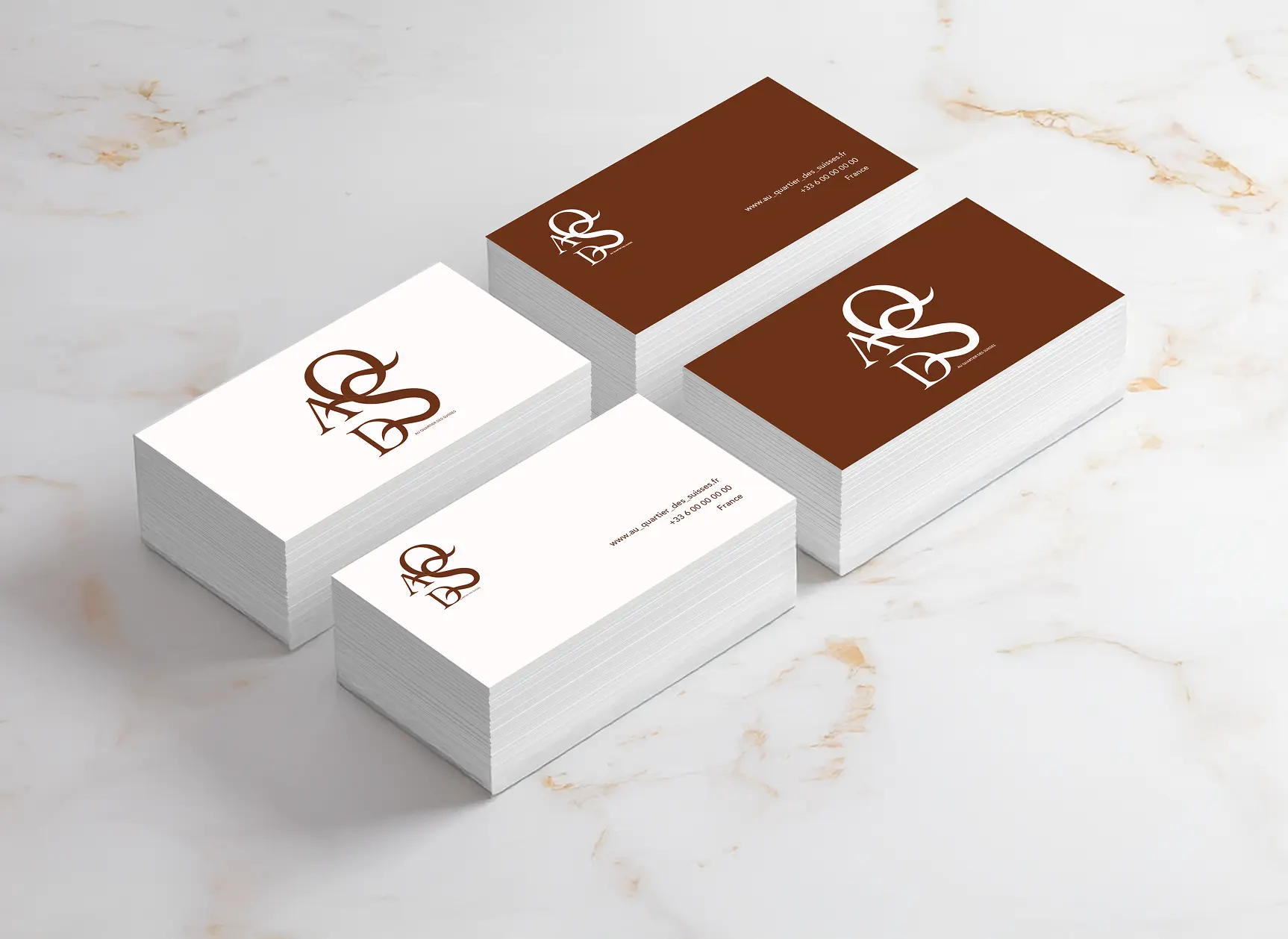

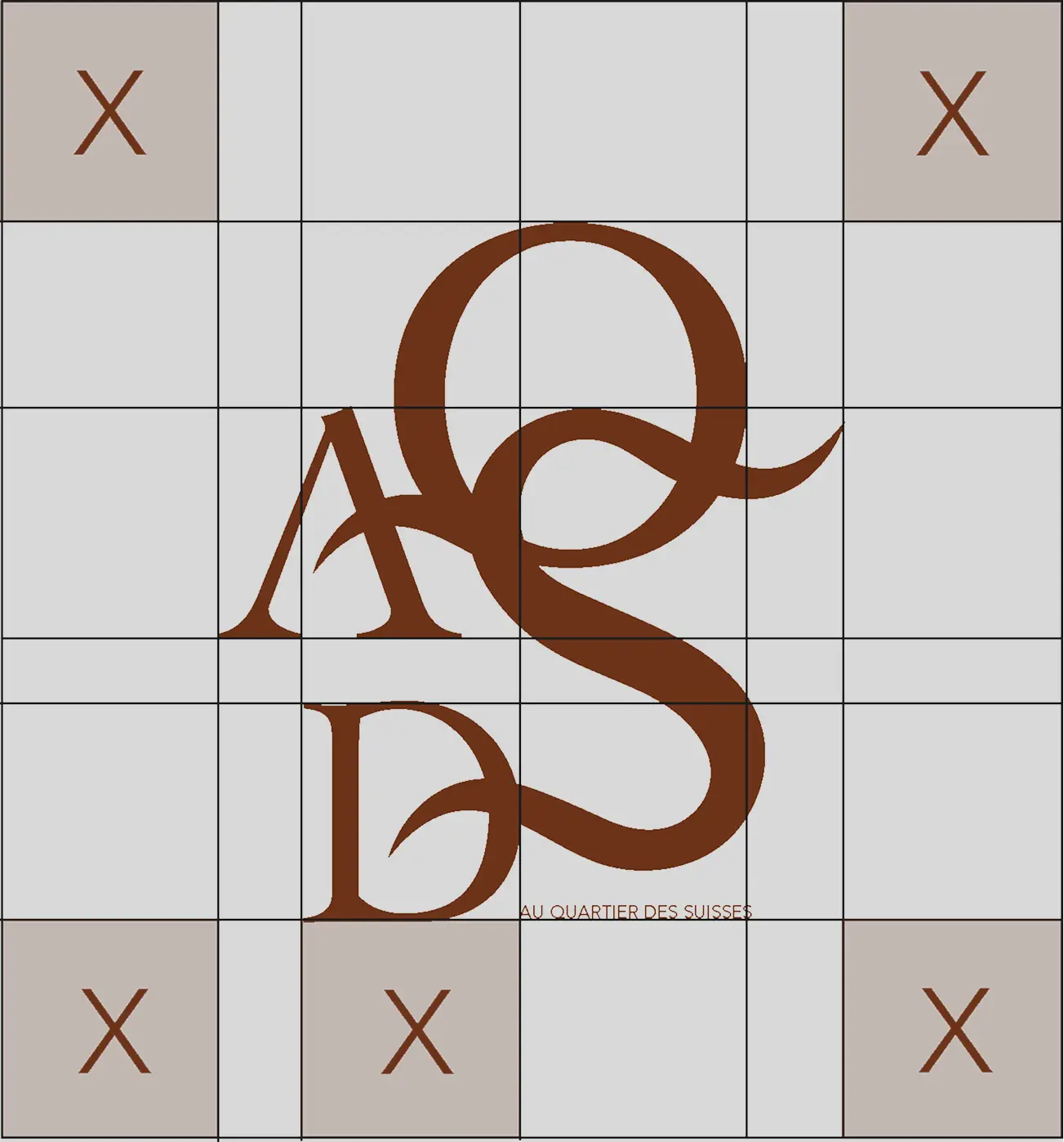
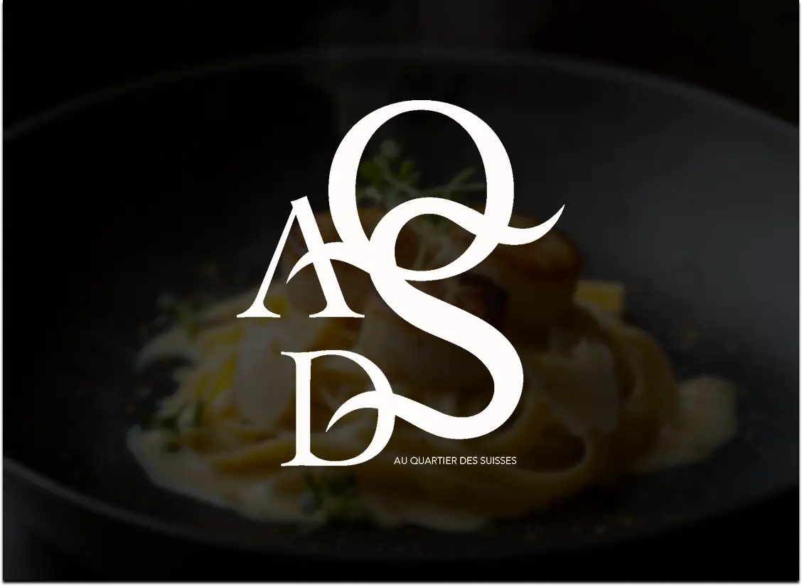
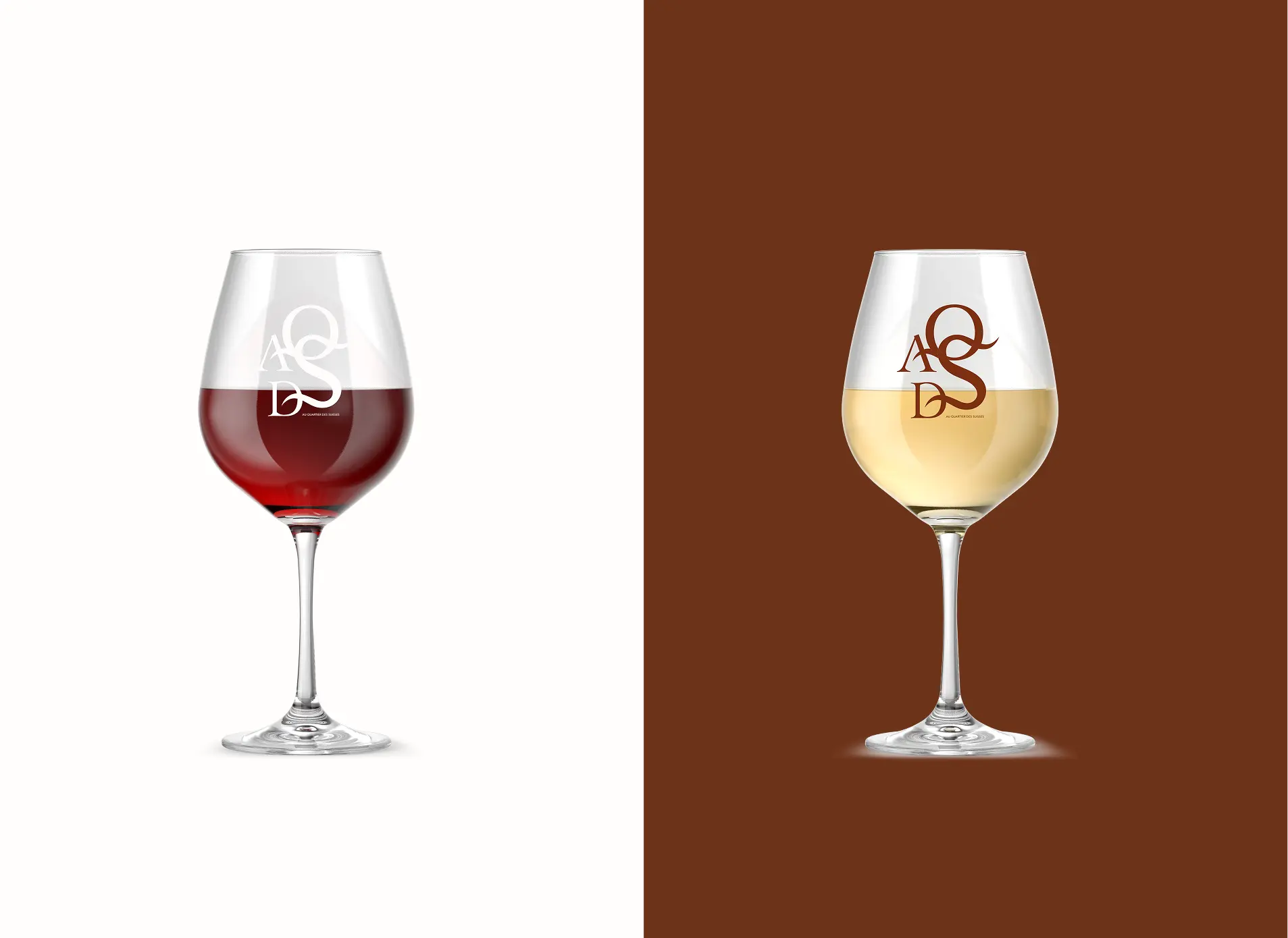
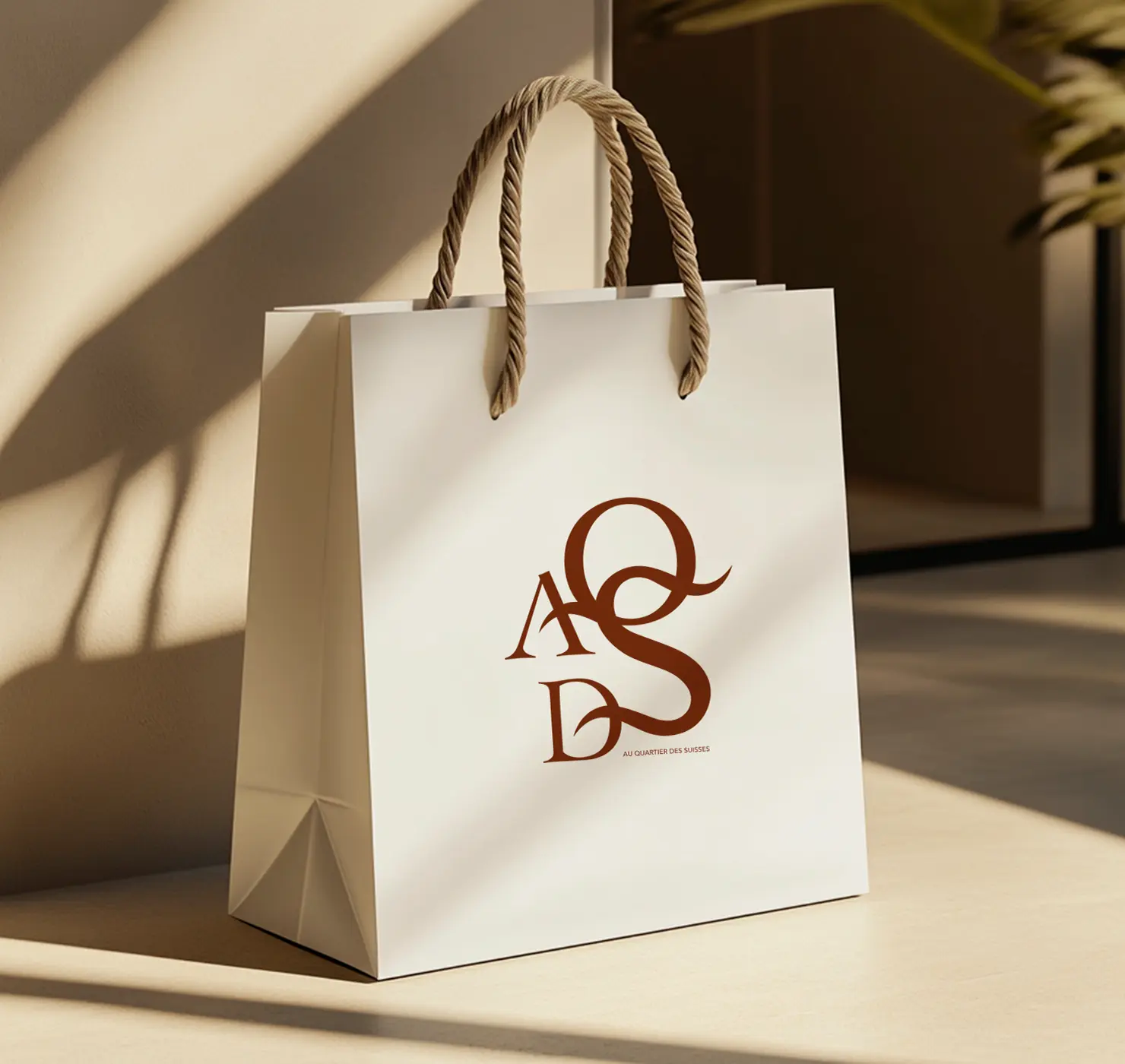
The logo is atypographic interplaywhere the lettersAQDSintertwine, forming a striking and elegant composition. This arrangement addsdynamismwhile maintainingbalance and aesthetic harmony.
- A refined, classic serif font with delicate details is used, emphasizing the premium and European style of the brand.
- The interwoven letters resemble vintage monograms, evoking Swiss heritage and the traditions of haute cuisine.
- The AQDS letters form an abbreviation of the restaurant’s name (Au Quartier des Suisses).
- The intertwined design creates a unique brand emblem, which can function as a standalone visual identity.
- This distinctive styling underscores exclusivity, premium quality, and the refined character of the restaurant.
.jpg)
Our services
From visual identity to digital presence
— our services are built to make your brand stand out and grow.
Website Design and Development
de sites Web
Visual identity
Digital Strategy & SMM
Photo & Video Production
Let's build
something
unforgettable